The common classes of button controls are:
These types of button controls will be described separately,
after a discussion of some special button state properties
that they share.
It is common in designing graphical interfaces for buttons to take on distinctive
appearances to reflect various situations, such as the following:
- the keyboard focus is currently on the button
- the button is either enabled or disabled
- the mouse is over the button
- the mouse button is currently pressed down
- the cursor has moved since the mouse button was pressed.
Most of this information is stored internally in auxiliary data structures
containing boolean-valued fields such as rollover?,
pointer-pressed?, grabbed?, focus?.
- normal
- checked
- disabled
- disabled-checked
- pressed
- pressed-checked
- rollover
- rollover-checked
The example below shows how some button states are displayed.
Observe how the buttons change their appearance when they have the
keyboard focus, whether they are being pressed currently or have
been selected via tabbing. Buttons that are disabled, however,
will not get the keyboard focus.
| Example:
Displaying Button States |
 |
{Dialog
    {spaced-hbox
        valign="bottom",
        {CommandButton
            height = 0.3in,
            label="Press me!"
        },
        {CommandButton
            height = 0.3in,
            label="Don't press me!",
            enabled? = false
        },
        {CheckButton
            height = 0.3in,
            label = "Checked",
            value = true
        },
        {CheckButton
            height = 0.3in,
            label = "Disabled",
            enabled? = false
        },
        {CheckButton
            height = 0.3in,
            label = "Checked and disabled",
            value = true,
            enabled? = false
        }
    }
}
| |
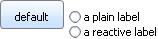
You can also attach a special reactive label
to a button that will change its form depending on the
state of the button. Instead of assigning text or a
graphical object to the button's label
property, you use the reactive-label
property, assigning different labels for different
states.
The following example shows some reactive labels:
| Example:
Reactive Labels |
 |
{CommandButton
    reactive-label=
    {ReactiveLabel
        label = {text default},
        label-disabled = {tiny (disabled)},
        label-pressed = {big pressed},
        label-rollover = {italic press me}
    }
}
{radio-buttons
    {RadioButton
        radio-value="first",
        label = "a plain label"
    },
    {RadioButton radio-value="second",
        reactive-label=
        {ReactiveLabel
            label = "a reactive label",
            label-checked = {text color="red", SELECTED},
            label-disabled = "(disabled)",
            label-disabled-checked = "(DISABLED)",
            label-pressed = "pressed!",
            label-pressed-checked = "PRESSED!",
            label-rollover = "rolled-over",
            label-rollover-checked = "ROLLED-OVER"
        }
    }
}
| |
When a user clicks and releases the mouse pointer on a
CommandButton, the button fires an
Action event at
itself. You can attach a dynamic event handler to handle the
Action event. Unlike some other
Controls, the
CommandButton does not have a current or committed value
associated with it.
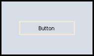
The following example shows a
CommandButton as the only component
in a
Dialog container. A dynamic event handler is
attached to the
CommandButton. It runs when the
Action
event is fired at the
CommandButton. The event handler:
- resets the CommandButton's label, and
- changes the background color of the container dialog.
Note also that the example sets the
CommandButton.style
property to
rollover, so the button visuals appear when
the pointer moves over the button.
| Example:
A Rollover-style Command Button |
 |
{value
    let df:Dialog =
    {Dialog width = 5cm,
        height = 3cm,
        border-width = 2pt,
        border-color = "black",
        valign = "center",
        {CommandButton label = "Button",
            style = "rollover",
            width = 3cm,
            border-width = 2pt,
            || Attach a dynamic event handler to handle
            || Action events
            {on Action at b:CommandButton do
                set b.label = {bold color = "cadetblue", Pressed}
                set df.use-look-and-feel?=false
                set df.background = "cadetblue"}
        }
    }
    df
}
| |
User input to a
CheckButton object produces one
of two results. Hence, its
value property
is either
true or
false.
In the following example, two dynamic event handlers
are attached to the
CheckButton to handle
ValueChanged and
ValueFinished events.
Whenever the user sets or clears the
CheckButton,
its label displays its current value, which is stored in its
value property. After that modal dialog is closed,
another dialog pops up to indicate that the
ValueFinished event
was also fired.
| Example:
A Check Button Fires ValueFinished |
 |
{CommandButton
    label = "click here",
    {on Action do
        || shortcut procedure for creating a modal
        || popup dialog
        {popup-message
            {VBox
                {CheckButton
                    label = "My CheckButton",
                    || Attach dynamic event handler
                    {on ValueChanged at cb:CheckButton do
                        set cb.label = cb.value
                    },
                    {on ValueFinished do
                        {popup-message "ValueFinished was fired!"}
                    }
                }
            }
        }
    }
}
| |
When you require the user to select exactly one of a small number
of items, you can use the
RadioButton and
RadioFrame classes. Radio buttons are grouped
together in one
RadioFrame. Each radio
button represents a possible choice. At most one radio
button can be selected at any time within each group.
The
value property of a
RadioButton is
either
true or
false depending on whether or
not it is currently selected, just as for a
CheckButton.
More interestingly, each
RadioButton also has a
radio-value property that its parent
RadioFrame
takes on as its
value property
if that radio button is selected. It is this
RadioFrame.value
property that is useful to the
Dialog.
When you initialize a RadioFrame, you can choose which,
if any, of its RadioButton will be selected when it is
first displayed by setting the RadioFrame's value
property to the desired button's radio-value.
A RadioFrame also has a has-value? property
that is false by default, indicating to any application
whether the RadioFrame has a value (and, if
possible, a radio button selected).
If you require the user to select a value, you can simply not
initialize the control's value, and no radio button will look
selected by default; has-value? will be set to true
automatically when the user selects a value. Otherwise, you may
give the control an initial value, and has-value? will
be true from the beginning.
After one button has been selected, it normally stays selected until
another button belonging to the same RadioFrame is selected.
Another way a button can be deselected is for the program to call the
RadioFrame's unset-value method, which will deselect
all the radio buttons and reset has-value? to false.
The following example shows a
RadioFrame
with three
RadioButtons. Click the
Show Current Values button to get the current value
of these objects'
value properties and the
radio-value property of the individual buttons
before and after selecting
the various radio buttons successively.
| Example:
Radio Button Values |
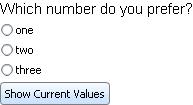 |
{value
    ||Create 3 RadioButtons, 1 RadioFrame, and 1 Button
    let rb1:RadioButton = {RadioButton label = "one", radio-value = 1}
    let rb2:RadioButton = {RadioButton label = "two", radio-value = 2}
    let rb3:RadioButton = {RadioButton label = "three", radio-value = 3}
    ||RadioFrame holds the RadioButtons
    let rf:RadioFrame =
        {RadioFrame
            {spaced-vbox rb1, rb2, rb3}
        }

    ||Button pops up a dialog displaying the value properties
    let b:CommandButton =
        {CommandButton
            label = "Show Current Values",
            {on Action do
                {popup-message
                    {spaced-vbox
                        {format
                            "1st Radio Button's Value: %s", rb1.value},
                        {format
                            "1st Radio Button's Radio Value: %s", rb1.radio-value},
                        {format
                            "2nd Radio Button's Value: %s", rb2.value},
                        {format
                            "2nd Radio Button's Radio Value: %s", rb2.radio-value},
                        {format
                            "3rd Radio Button's Value: %s", rb3.value},
                        {format
                            "3rd Radio Button's Radio Value: %s", rb3.radio-value},
                        {format
                            "RadioFrame's Value: %s", rf.value},
                        {format
                            "RadioFrame's Has-value? flag: %s", rf.has-value?}
                    }
                }
            }
        } ||CommandButton
    ||Use VBox to hold text, RadioFrame, and Button
    {spaced-vbox
        "Which number do you prefer?",
        rf,
        b
    }
}
| |
The
RadioButton.radio-value property is
the most critical option to specify when initializing a
RadioButton. since it supplies the value for the
RadioFrame when the button is selected.
Its default value is
null.
The
RadioButton.label option determines what the user
sees displayed next to the
RadioButton. Its default value
is copied from the button's
radio-value property.
The
RadioButton.value property has the value
true when its button is currently selected; otherwise
it is
false. It should not be set directly by your
code: it is changed automatically when a new button is selected,
either by manipulation of the controls, or by resetting
the
RadioFrame.value directly.
The
RadioButton.radio-frame property is a nonlocal option
that applies to both
RadioFrames and
RadioButtons. When set on a radio button, it specifies the
RadioFrame that the button belongs to.
Usually it is set automatically on the
RadioFrame itself
when it is first created: you instantiate the radio frame,
and it automatically sets its own
radio-frame
property to itself. This allows any radio
buttons graphically contained by it to access
the same
radio-frame value.
| Option | Default |
Description |
|---|
| RadioFrame.has-value? | false | Specifies whether the radio button container has a value and
(if possible) an active radio button. This property works in
conjunction with the container's value property.
- true:
One of the radio buttons has to be active at any
given time.
The active radio button is specified by the
container's value property. During
instantiation, if the value property is null, the Curl® Runtime Environment
arbitrarily selects one of the radio buttons. - false:
None of the radio buttons need to be active.
During instantiation, if value is set to a
valid radio button value, has-value? is
ignored and that radio button is made active after
all.
|
| RadioButton.label | null | The display accompanying the radio button. It is
usually (but not necessarily) text. |
| RadioButton.radio-frame | null | The RadioFrame that contains the radio button. |
| RadioButton.radio-value | null | The value of the RadioFrame when this button is selected. |
| RadioButton.value | false | True or false, depending on whether the button is currently selected. |
| RadioFrame.value | null | The radio-value of the currently selected RadioButton, if any. |
| RadioFrame.selected-button | null | The currently selected RadioButton, if any. |
The Curl language provides
radio-buttons, a shortcut procedure for
creating multiple radio buttons positioned either horizontally or
vertically within a radio frame.
It returns a
RadioFrame object.
Using
radio-buttons, you specify the following:
- the direction in which the radio buttons are to be
arranged: either Orientation.vertical (the default) or
Orientation.horizontal.
- the values of each radio button. Both label and
radio-value properties are usually set to the same value.
- which radio button should be initially active upon
loading. You do so by using the value keyword
argument, which sets the value property of the
returned RadioFrame.
The following shows a simpler version of the preceding example.
| Example:
Using the radio-buttons Shortcut |
 |
{Dialog
    {radio-buttons
        || Comment out the following line to have no initial value set
        value = "three",
        "one",
        "two",
        "three"
    }
}
| |
Copyright © 1998-2019 SCSK Corporation.
All rights reserved.
Curl, the Curl logo, Surge, and the Surge logo are trademarks of SCSK Corporation.
that are registered in the United States. Surge
Lab, the Surge Lab logo, and the Surge Lab Visual Layout Editor (VLE)
logo are trademarks of SCSK Corporation.